

Rethinking Inflation
Rethinking Inflation
Guest Post by David Henslovitz, Founder of Olive Tree Technologies
Thank you for joining us for this edition of the NovaBlock newsletter. Here, we explore the intersection of technology, finance, politics, and of course, the crypto asset space.
In this post, David will delve into the intricacies of measuring inflation. He begins by discussing the drawbacks to the commonly used CPI and then describes in detail how to measure inflation in novel ways using publicly available consumer purchasing data.
David Henslovitz is a Data Scientist, Engineer and Researcher in the fields of Finance and Healthcare. He graduated from Galvanize’s Data Science Immersive program and is a student of Computer Science at Georgia Tech focusing on Artificial Intelligence. He is also the founder of Olive Tree Technologies, LLC, a consulting firm which specializes in Data Engineering, Analytics and Machine Learning. For more project details including code please visit https://github.com/dhense177/InflationAnalysis. David can be contacted at dhenslovitz3@gatech.edu if you have any questions or comments.
Introduction
If you follow financial markets and business news, you’re probably familiar with the criteria that ‘economic experts’ use to judge the health of the economy. The statistics they commonly cite include the GDP growth rate, the unemployment rate, and the median household income. In many instances, that’s it. As economics professor Richard Wolff [1] puts it, this is akin to being told by the doctor that you are healthy because you have good eyesight and no broken bones. You probably wouldn’t go to the same doctor again, as you know your health is influenced by far more variables. We should be just as skeptical about our so-called economic pundits, as the economy is an extremely complicated system influenced by countless factors.
As I began to research some of these economic statistics, I noticed that the analysis presented by most websites and data sources used the Consumer Price Index (CPI) to compare statistical values over different time periods. The integrity and accuracy of this inflation estimate is assumed upfront – it is widely accepted and rarely challenged. But if you try to understand how CPI is calculated, you won’t get very far. CPI is linked to all sorts of economic indicators and is directly tied to the amount the government pays out in benefits to citizens for programs like Social Security and Medicaid. Its use as the de facto inflation metric carries with it wide-ranging implications, making it prudent to consider using a more accurate and transparent measurement instead. This article describes what an accurate inflation index should look like, what we know about the CPI, and how we might be able to measure inflation in other ways.
Inflation, the CPI and Existing Alternatives
An accurate inflation index should measure the purchasing power of a consumer over time – how far their dollar goes now compared to how far it went in previous time periods. The most straightforward way to do this is to measure the price of a specific, fixed basket of goods over time. The Big Mac Index (BMI) does just this – albeit with just a single good. It measures the price of a McDonald’s Big Mac over time. If you were to extend this to all the major goods and services that consumers buy, you would have a very good estimate of the inflation rate.
There are a few tricky parts to keep in mind though – the first has to do with demand elasticity. Sometimes, consumers will change what they buy, or not consume a specific good or service entirely if its price changes. Secondly, new products and services can enter the marketplace, some of which may not have any substitutes, and there will be no historical data to compare prices of these goods and services with present prices. Lastly, the quality of goods and services can change over time, making comparison between time periods difficult (for example: electronics improving and declining in cost over time).
To calculate CPI, the Bureau of Labor Statistics (BLS) tracks the prices of around 80,000 items, but does not publicly disclose the items tracked nor their weights in the index. The methodology used has changed several times over the past few decades, but again no details have been provided to the public. As I alluded to above, by massaging the CPI figures to show low inflation, the government can pay less in benefits to its citizen as it would under higher inflation [2].
Another incentive the government has to keep the rate low is to avoid a market downturn. Higher inflation generally leads to higher interest rates, which incentivize more savings and less consumption, but our economic system is addicted to continuous and growing consumption. A drop in consumption could severely damage many businesses, some of which already rely on taxpayer subsidies and government debt to survive [3].
The low inflation numbers do not level with the unprecedented money printing campaign our country has undergone, most notably since the 2008 Great Recession and especially recently since the corona-virus pandemic began [4]. However, the injection of new cash does not cause immediate price hikes, as it takes time for these funds to circulate through the economy. The funds have primarily gone to banks, financial institutions, and public companies who have used techniques such as stock buybacks to compensate management and shareholders. Banks, corporations and wealthy individuals have mostly hoarded these funds or invested them in financial assets, ‘quarantining’ large quantities of cash from the economy. Therefore, we shouldn’t expect to see high inflation due to money creation alone, at least not in the short term. [6]
The US dollar’s current status as the reserve currency of the world inhibits the rise in the inflation rate for now as there is an abundant supply of dollars around the globe, but as the US becomes an increasingly untrustworthy global partner, its reserve currency status could change. If this were to happen, it would likely cause an explosion in the inflation rate as foreign governments switch their holdings to other currencies or assets [5]. For these reasons, the CPI is very likely understated (perhaps considerably) as incentives align with low stated rates.
There are a few alternatives to the CPI that exist. First is the Chapwood Index – an index which tracks the prices of 500 items that most Americans purchase. I did not find any information as to how the items were selected, nor could I find the weights used in the calculations, but the list of the 500 items is provided. The inflation data displayed on their website is astonishing. Focusing on measuring inflation in American cities, the annual inflation rates often exceed 10%, which is much higher than CPI which has barely eclipsed 2% in recent years [7]. Unfortunately, the Index does not have national figures available and only has data going back to 2015. A second alternative is the Big Mac Index, mentioned above. While only a single item is tracked, the product has essentially not changed in many decades and is a relatively inelastic item, as it has always been among the cheapest options for a meal out. I found data tracking the price of a Big Mac going back to the mid-1980’s which I used in my analysis.
Methodology: Overview
When creating an inflation index, I made a few assumptions. First, in order to ensure a consistent basket of goods/services over time, I limited my analysis to inelastic goods/services determined by common sense (not quantified with consumer purchasing data). A good example is prescription drugs - if your life or health is determined by your access to a certain drug, you will pay just about any price for it. Second, I did not include items such as electronics, many of which have only recently entered the marketplace and whose quality is improving rapidly, making it very difficult to measure consumer purchasing power over time. Since purchases such as TVs are infrequent for a typical household, their omission won’t make much of a difference. Instead, I measured changes in the prices paid for broad categories of goods and services over time, in aggregate comprising ~70% of a typical household’s yearly disposable income. I do not measure the prices of individual items or services, except for my inclusion of the BMI data. Lastly, I assumed the goods and services within these categories have not changed in quality over the duration of my analysis (the last 30 years).
The inflation estimates derived from this data will likely underestimate price increases. Even though in general the categories of goods and services I’m focusing on are inelastic, there will be items for which people find a cheaper option or do without entirely. This could mean downsizing to pay less rent or going without health insurance. In extreme cases, Americans sometimes cut their prescriptions and medications into parts to save money. This behavior is clearly dangerous and sometimes deadly, but many simply do not have another choice.
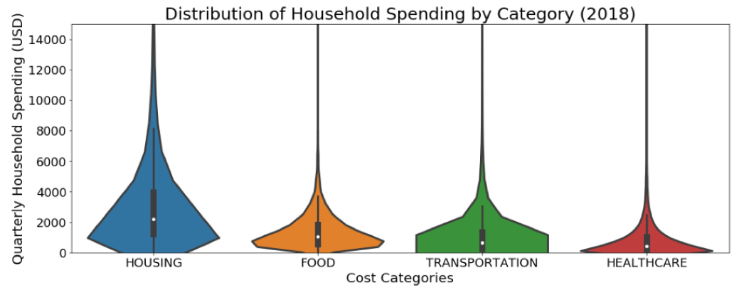
In order to convey the importance of the inflation estimates, I compare the median income, salary, and government benefits for households over time horizons using different rates (CPI, BMI, and my calculated indices). I use the median as opposed to the mean because the data is skewed right – higher income individuals create a significant right tail in the cost distributions, inflating averages to the point where they no longer reflect an ‘average’ or typical US household or citizen. The median is a much more informative statistic in this scenario. This can be seen by looking at the distributions of various spending categories in Figure 1.
Lastly, I compare the percent change in income and wage figures to economy-level growth rates like the performance of the S&P 500 index and the GDP growth rate. This will allow us to see how a typical US family fares in terms of purchasing power over time relative to the economy in general and to the shareholder-class, which generally comprise the wealthiest 10% of the population [8].
Figure 1
Methodology: Details
There were several datasets needed to properly conduct this research. I relied heavily on government economic datasets to complete the analysis, namely the Consumer Expenditure Survey (CX), the Current Population Survey (CPS), the Survey on Income and Poverty Estimates (SAIPE) as well as annual CPI figures. I also gathered annual price data for the Big Mac Index in addition to annual real GDP growth rates and S&P500 growth figures.
For the indices below (aside from the BMI), I calculated annual inflation for each category of costs, and weighted each of these categories relative to the amount a typical household spent on all of these categories. For example, the inflation index #1 below contains cost categories Housing, Food, Healthcare and Transportation. These costs in aggregate comprise ~70% of total household spending. Housing comprises ~30% of household spending. The weight of Housing costs in the index is therefore 0.3/0.7 (~.43). These weights are multiplied by the percentage change in household dollars spent relative to the previous year for items in each of the different categories and then summed to arrive at the annual inflation estimates. The same methodology is applied to the subcategories index which measures spending on a more granular level.
Figure 2
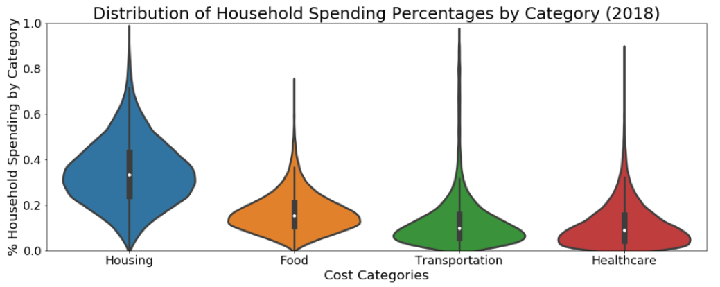
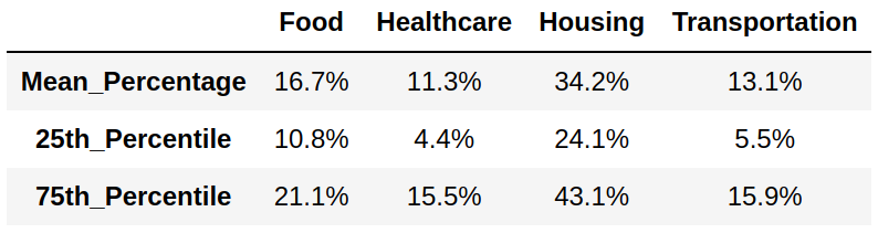
Table 1 - Percent of Household Spending by Cost Category
Inflation Index #1: Consumer Expenditure Categories
To estimate the level of inflation from consumer expenditure data, I chose four high-level cost categories to focus on: Housing, Healthcare, Food and Transportation. The categories generally contain inelastic goods, minimizing the amount by which consumer would change consumption habits if prices were to change. Figure 1 above shows the distributions of quarterly household spending for each of these categories of goods and services. As previously indicated, the median is chosen as the quantity of comparison because of the large skew in the data. Figure 2 shows the percentage of household spending by category which is less skewed but still not normally distributed.
Inflation Index #2: Consumer Expenditure Subcategories
The subcategory index selects cost items from within the categories described above based on their inelasticity of demand. For example, within the Healthcare category, drugs, medical services and medical supplies are included while health insurance is not. Some people forgo getting health insurance because they cannot afford it, but in general people are not able to forgo drugs and other medical goods and services.
Inflation Index #3: Consumer Expenditure Rent
A growing proportion of Americans are renters as opposed to owners, and this trend is set to continue and intensify into the future [9]. Rent is a very inelastic consumption item and represents around 30% of a typical household’s income, and thus is a good singular cost to track over time and use as an inflation metric.
Inflation Index #4: Big Mac Index
This index tracks the price of a Big Mac burger over time, and is particularly interesting to include since it tracks a specific good in the market as opposed to a category of goods or services.
Results
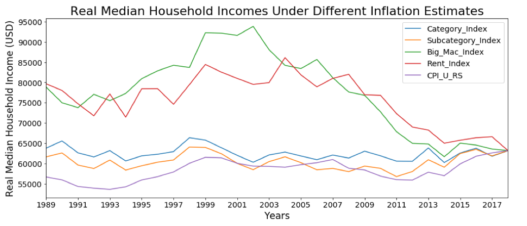
Figure 3 below shows the real median household income discounted using each of the four inflation indices mentioned above, compared with the CPI benchmark. The graph indicates real household income has not fared well when using the BMI or Rent indices as the underlying inflation metric. Purchasing power discounted using Big Mac and rental prices peaked between 2000 and 2005 at around 94,000 and 85,000, respectively. In 2018, incomes hovered around 63,000. So, in the last 15 years, consumers of burgers and rent have lost ~25% of their purchasing power. These downward income trends are steep and explain why so many young people (primarily renters) are struggling in addition to poorer small rural communities that don’t have more than a few fast-food options to feed themselves.
The other indices do not suggest such an extreme loss of purchasing power; real incomes are closer to the figures calculated using the CPI. However, as noted in previous sections these figures are based on inflation rates that are likely underestimated as consumers change their purchasing behavior towards cheaper goods or even forgo certain goods entirely, even if they are inelastic goods.
Figure 3
Looking at Figure 4, the CPI index shows slight real income growth over the past 30 years while the category and subcategory indices shows no real income growth during this period. Table 2 below shows real annual household income growth assuming inflation under these 3 indices, displayed over different time periods.
Figure 4
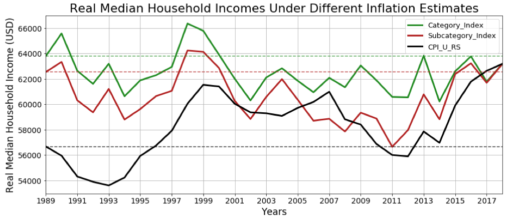
Dashed lines correspond to 1989 real median household income
Table 2 - Real Income Growth Under Different Inflation Metrics

* Dates as of 2018
Next, I decompose household income into two parts: 1) namely wages and salaries and 2) all government incomes (which includes welfare programs such as social security, child care, public assistance, unemployment compensation, and other government payments). I use the subcategory index as the inflation rate and adjusted these figures into real terms for the income components between 2004-2018.
Looking at Figure 5 below we can see the annual percent change of real income component figures in addition to the annual percent change of GDP growth over the past 15 years. A few important takeaways: Real GDP growth averaged ~2% annually during this period, while real total household income and real wages show almost no growth. Looking at the income components, government incomes grew at a rate around 18 times that of wages over this period. Since taxation is the primary method of funding government welfare programs, this signifies a heavier burden placed on American taxpayers to fund such programs.
Figure 5

Dashed lines correspond to average percent change for each statistic over time period 2004-2018
Lastly, we can compare income growth performance against GDP and S&P growth over the past 15 years at 5-year increments. The S&P 500 dominates all other growth rates during each time period. Obviously much has changed in 2020, and once new data is made available an updated report will tell us how the virus has impacted incomes and economic growth indicators comparatively.
Table 3 - Real Income and Income Component Growth vs Real GDP and S&P500 Growth

* Dates as of 2018
Conclusion
This analysis provides a strong foundation for understanding economic performance through a more transparent view of inflation which influences many economic statistics. While this piece focuses on incomes, the inflation indices calculated can be applied to better understand changes in many other areas of interest including government spending and taxes. Using CPI figures, real income growth for a typical American household has not been strong but has budged upward over the past three decades. However, the other indices suggest zero or negative real income growth during this period.
Looking at specific segments of the population (rural vs. urban, young vs. middle-aged vs. elderly, etc.) would provide insight into those most hurt by lost purchasing power. Government payment incomes grew at a faster clip than wages, meaning that the American taxpayer is picking up the tab for many who do not earn a livable income or who are elderly or disabled. A good example would be Walmart employees having to rely on food stamps. Lastly, economic growth and stock market performance have significantly outperformed median income growth, explaining the widening gap between rich and poor in America.
Sources
[1] Richard Wolff, Economic Update: Exposing Economic Myths https://www.democracyatwork.info/eu_exposing_economic_myths
[2] Perianne Boring, If You Want To Know The Real Rate Of Inflation, Don't Bother With The CPI https://www.forbes.com/sites/perianneboring/2014/02/03/if-you-want-to-know-the-real-rate-of-inflation-dont-bother-with-the-cpi/#312b63e3200b
[3] Robert Reich, How Corporate Welfare Hurts You https://prospect.org/economy/corporate-welfare-hurts/
[4] St. Louis Fed Chart, Monetary Base https://fred.stlouisfed.org/series/BOGMBASE
[5] Saifedean Ammous, The Bitcoin Standard
[6] Justice Litle, Inflation and Velocity of Money https://inflationdata.com/articles/2010/12/29/inflation-and-velocity-of-money/
[7] Fed historical CPI inflation figures https://www.minneapolisfed.org/about-us/monetary-policy/inflation-calculator/consumer-price-index-1913-
[8] Patricia Cohen, We All Have a Stake in the Stock Market, Right? Guess Again https://www.nytimes.com/2018/02/08/business/economy/stocks-economy.html
[9] Anthony Cilluffo, A.W. Geiger and Richard Fry, More U.S. households are renting than at any point in 50 years https://www.pewresearch.org/fact-tank/2017/07/19/more-u-s-households-are-renting-than-at-any-point-in-50-years/